Soapy/ Product Packaging
For Soapy’s bath bomb packaging, I wanted to create something that feels as fun and fresh as their product. The swirling organic patterns and vibrant colors mirror the playful, uplifting experience Soapy promises with every bath. The typography adds a quirky and relaxed touch, reflecting the brand’s approachable, friendly vibe. With its bold combination of earthy orange, green, and red, the packaging not only catches the eye but also gives a sense of warmth and relaxation. The design ties in perfectly with Soapy’s ethos of being both organic and fun, making it stand out on the shelves while communicating a sense of comfort and care.
You may also like
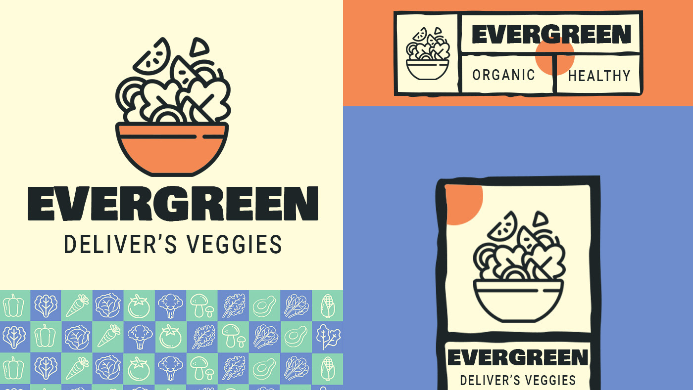
EVERGREEN/PRODUCT PACKAGING
2022
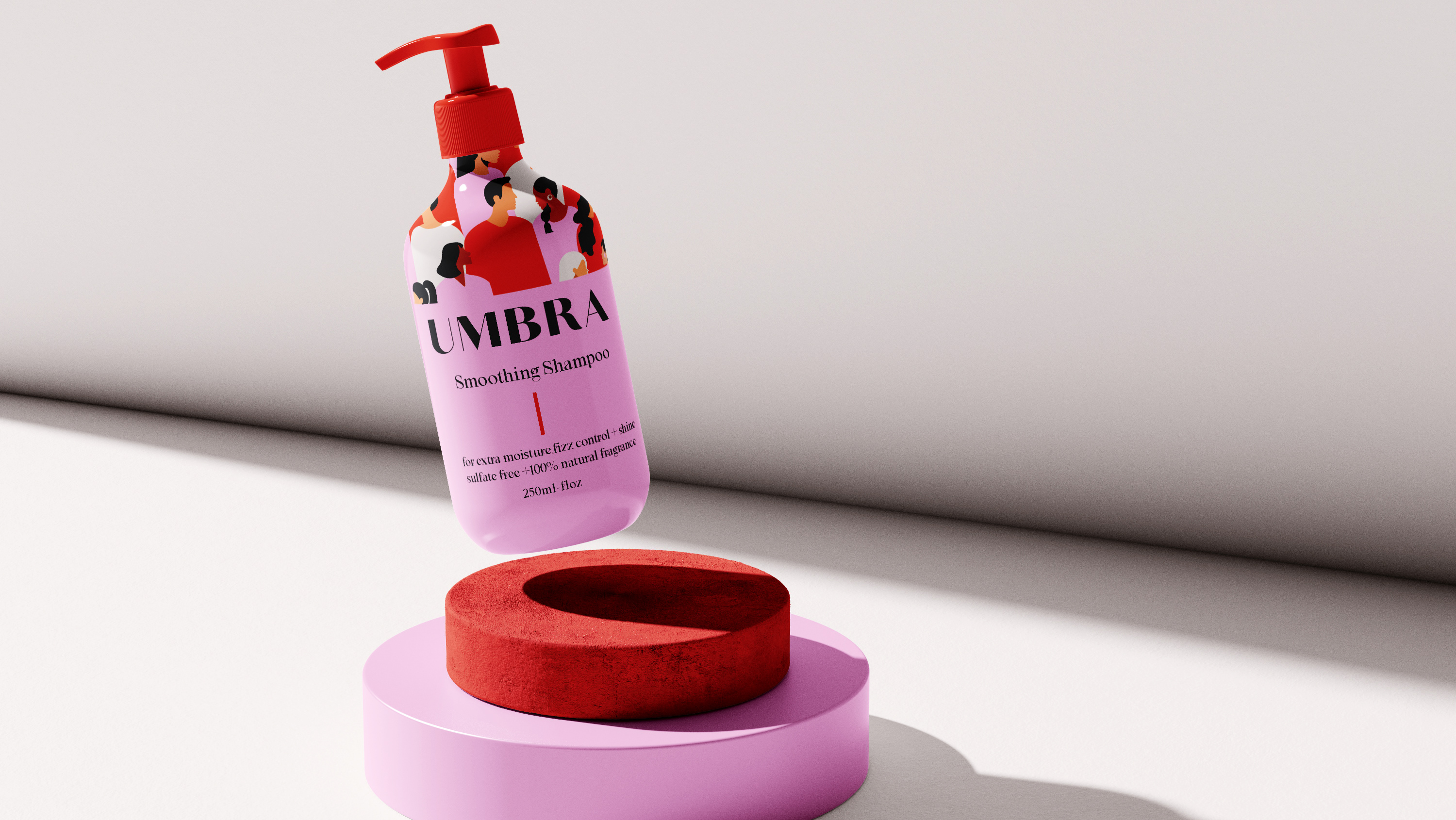
UMBRA/ HAIR-CARE BRAND IDENTITY
2021
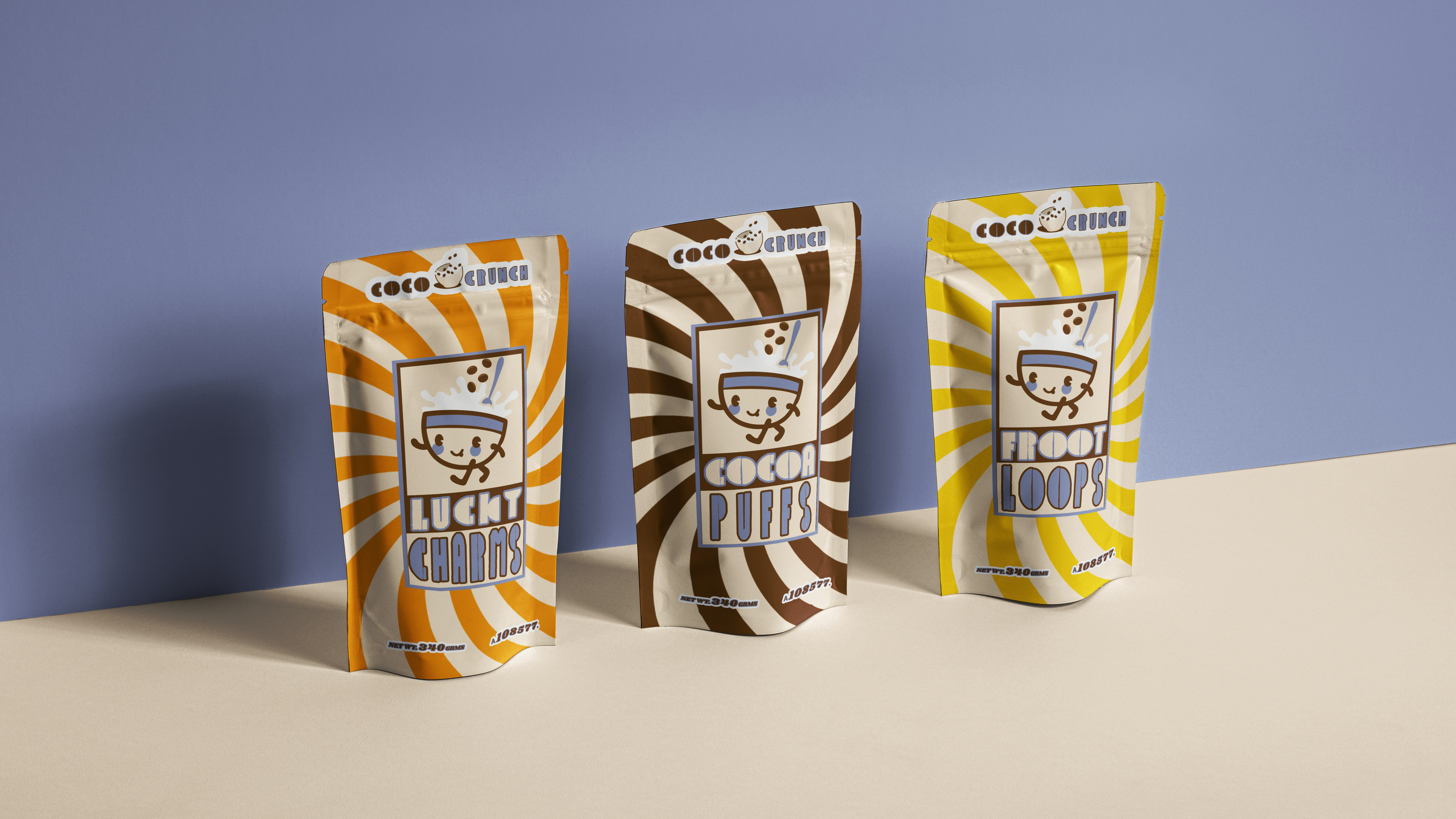
COCO CRUNCH/FOOD PACKAGING/ BRAND IDENTITY
2022
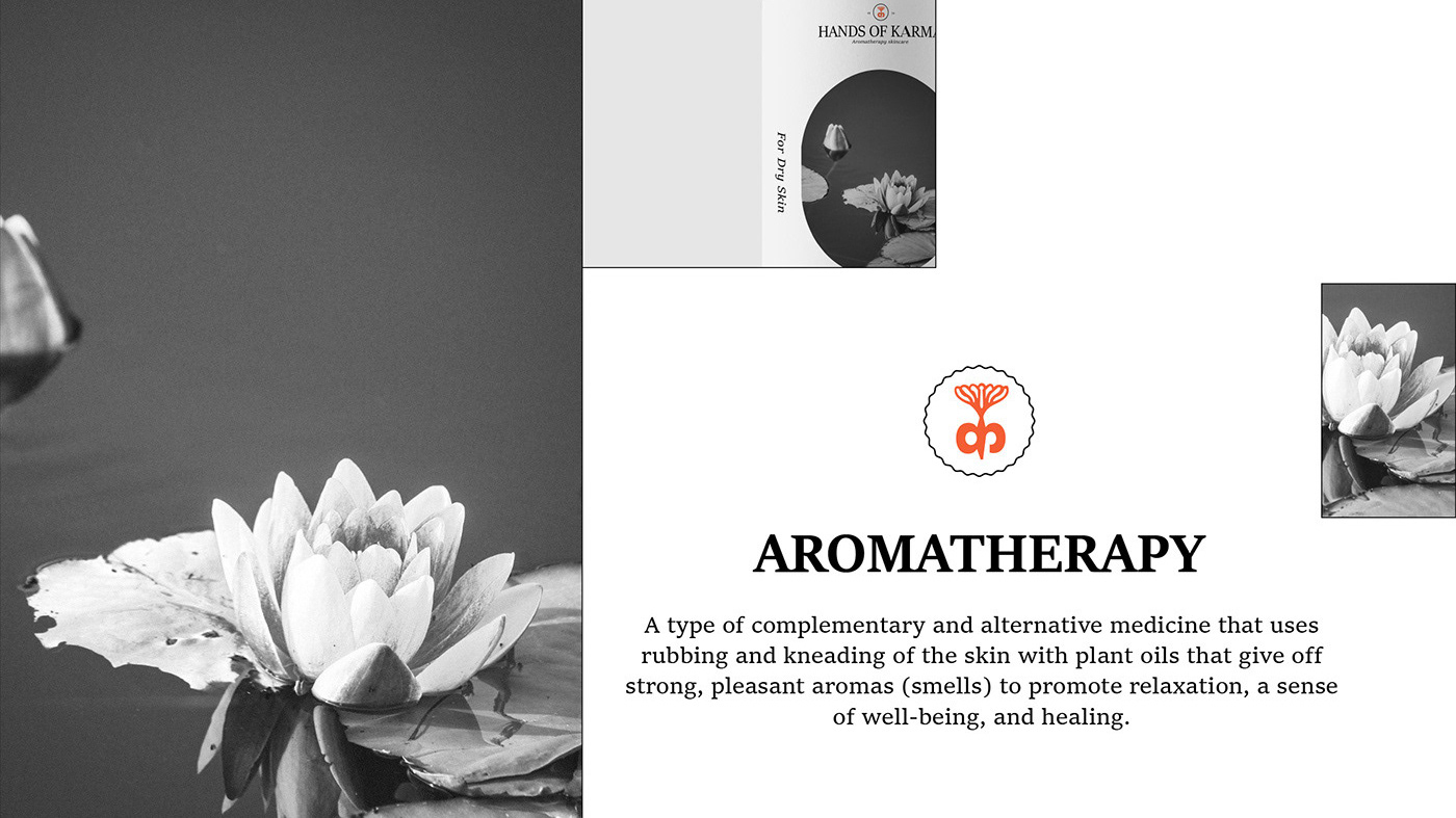
HANDS OF KARMA/SKINCARE-AROMATHERAPY
2022
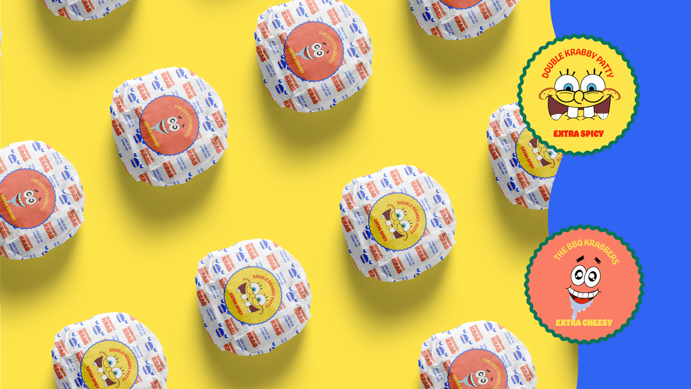
Krusty Krab / RE-BRANDING
2022
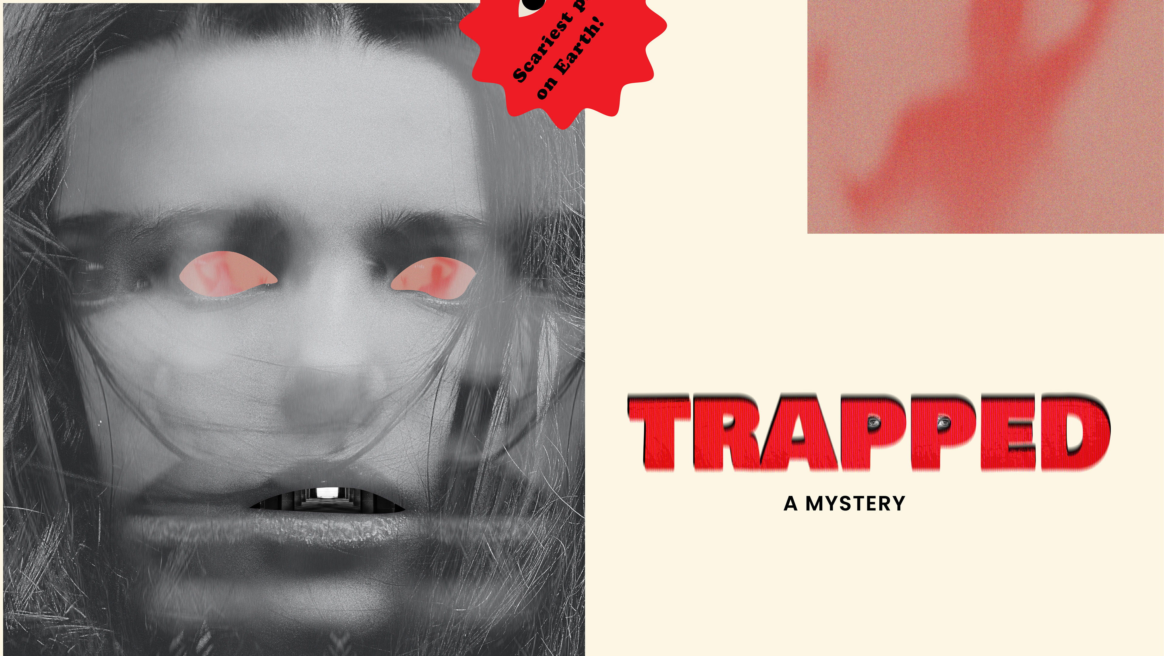
TRAPPED-A MYSTERY/MOVIE BRANDING
2023
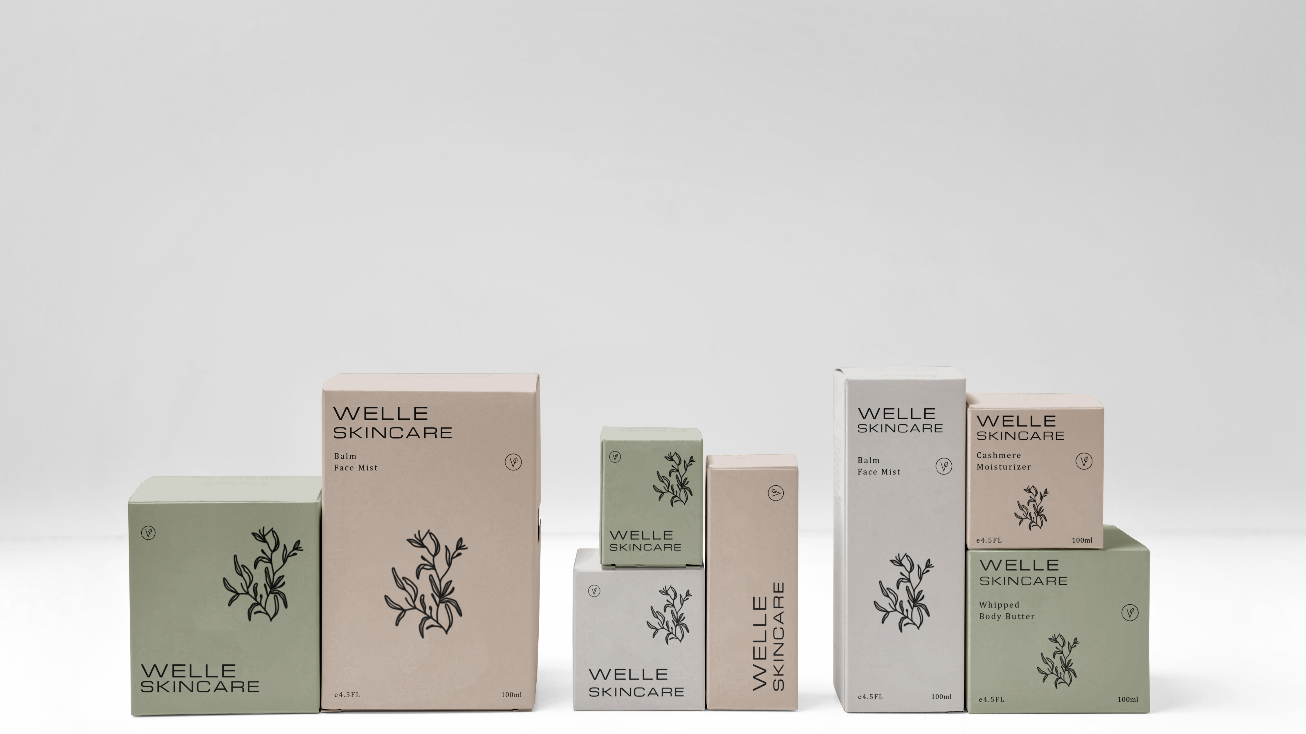
WELLE/ PRODUCT PACKAGING/ BRAND IDENTITY
2022
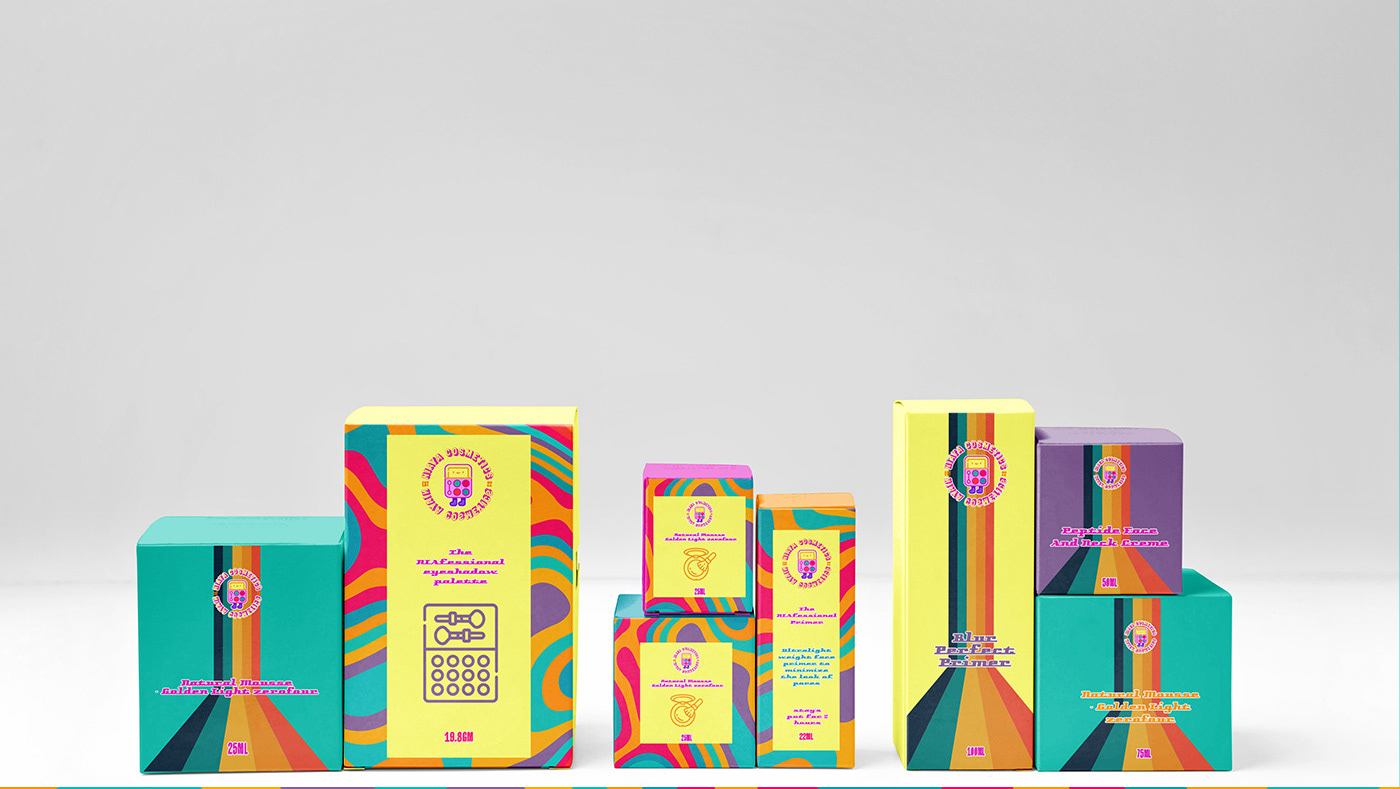
NIAYA/PACKAGING DESIGN FOR COSMETIC BRAND
2022
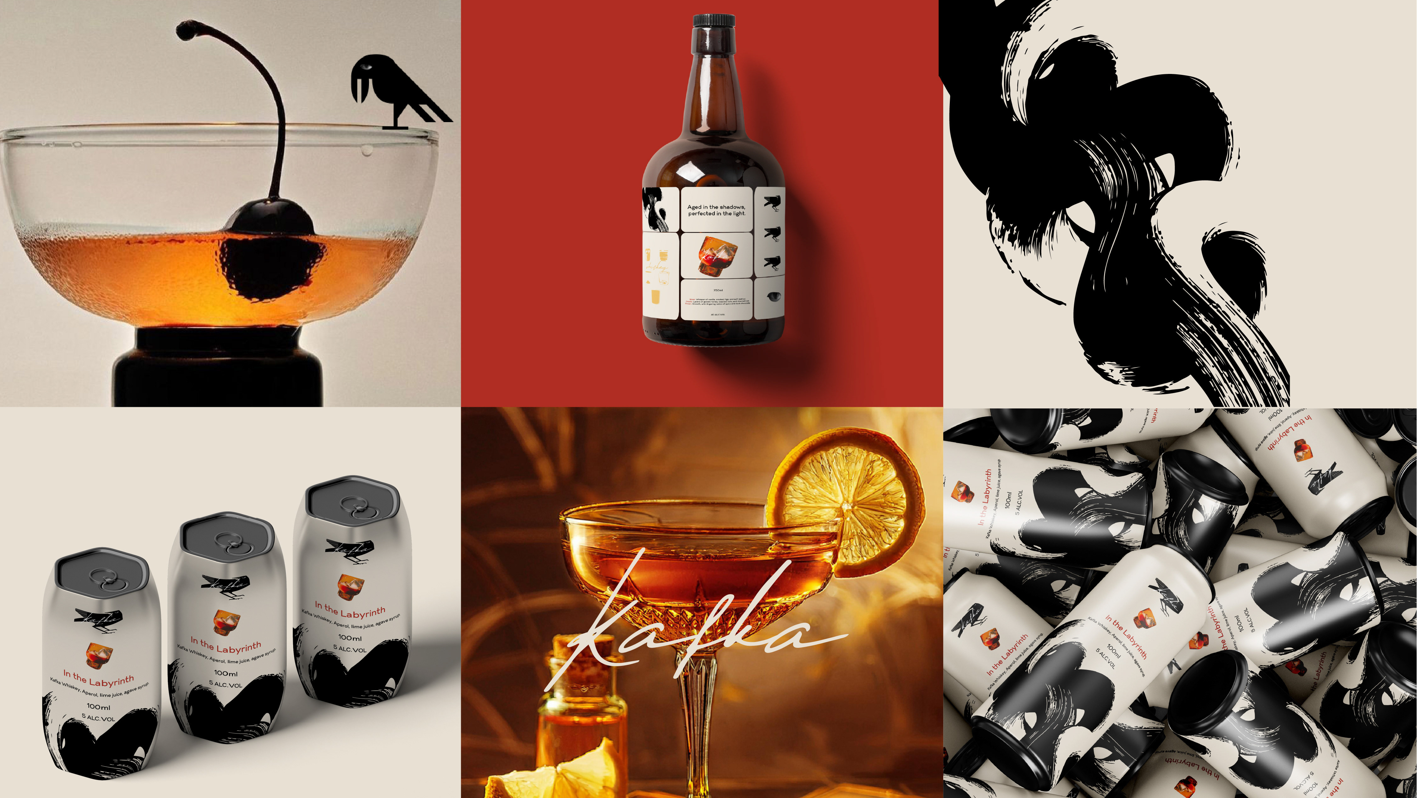
KAFKA-BRANDING & PACKAGING DESIGN
2025
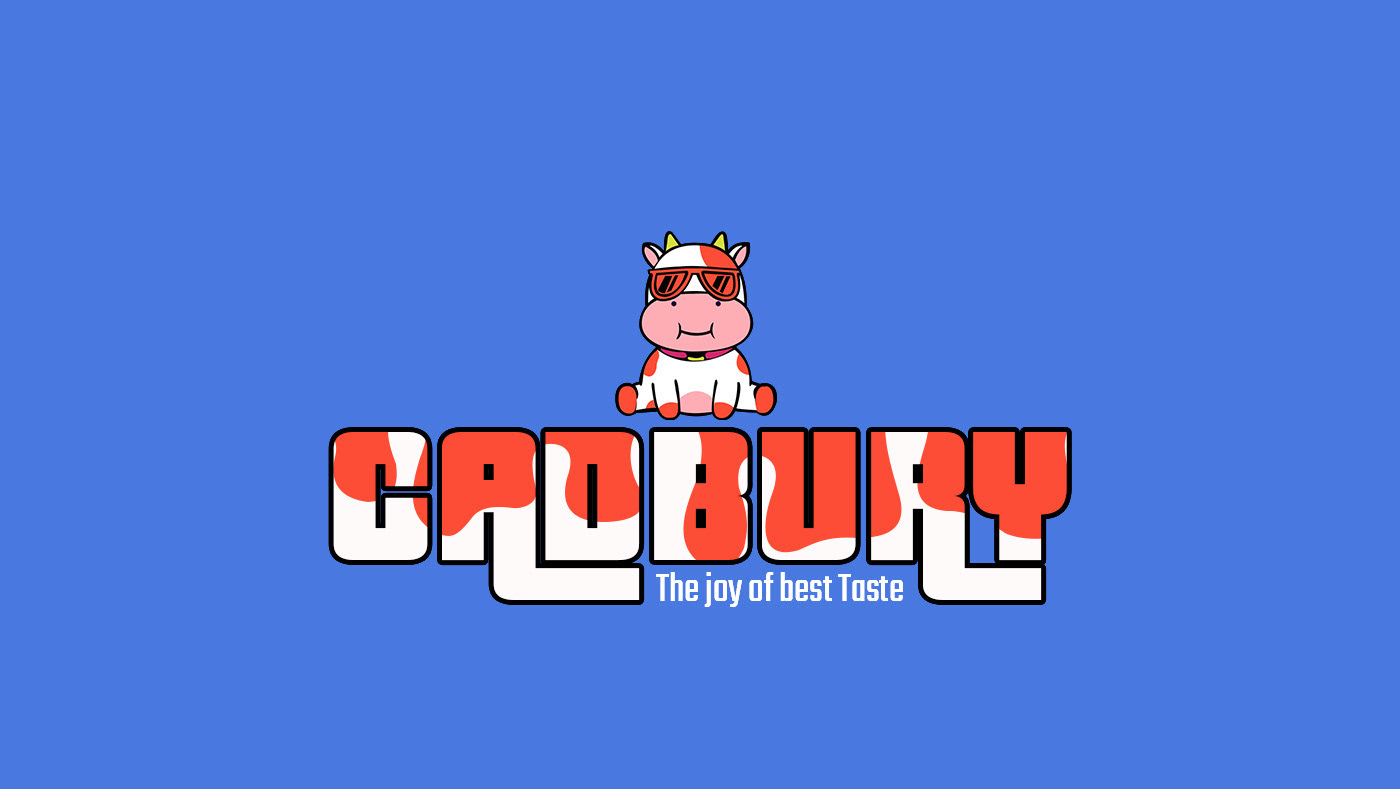
RE-BRANDIND 'CADBURY'
2022
