'SQUEEZY' BRANDIND AND PACKAGING DESIGN
Squeezy’s branding was all about capturing the product’s essence—fresh, handy, and full of personality. I opted for a punchy color palette and energetic patterns that echo the “squeeze-and-go” convenience of the product. The logo and typography are playful yet clean, creating a vibe that’s upbeat without overwhelming the design. This look is designed to jump off the shelves and connect with customers looking for quick, fun, and flavor-packed options. Squeezy’s packaging brings a spark of excitement, making it the go-to choice for anyone craving something a little extra in their routine.
You may also like
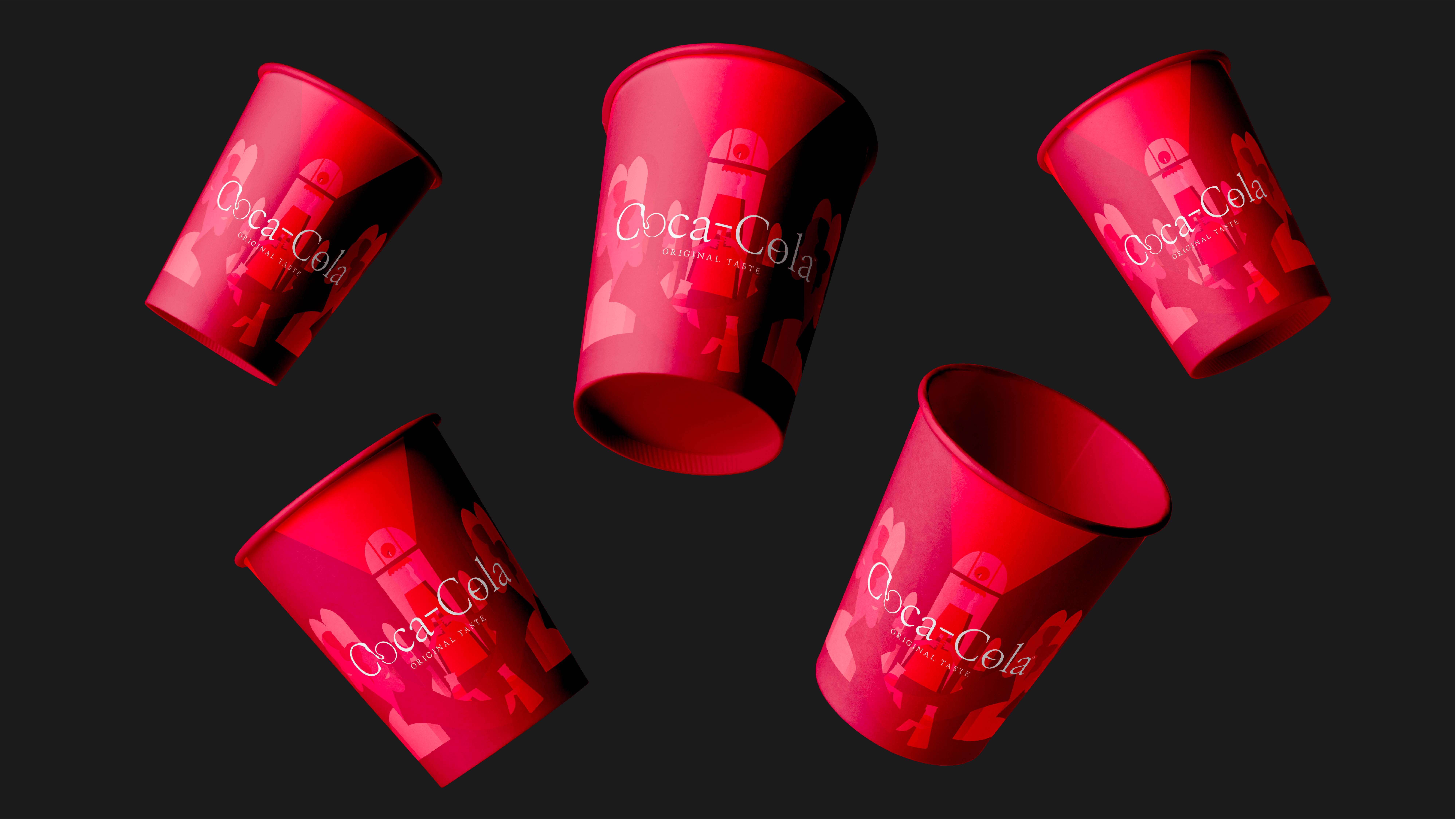
Coca-Cola/ REBRANDING
2024
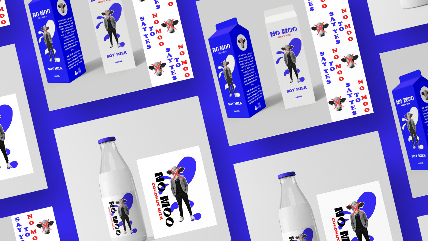
NO MOO/ VEGAN MILK- PACKAGING & BRANDING
2022
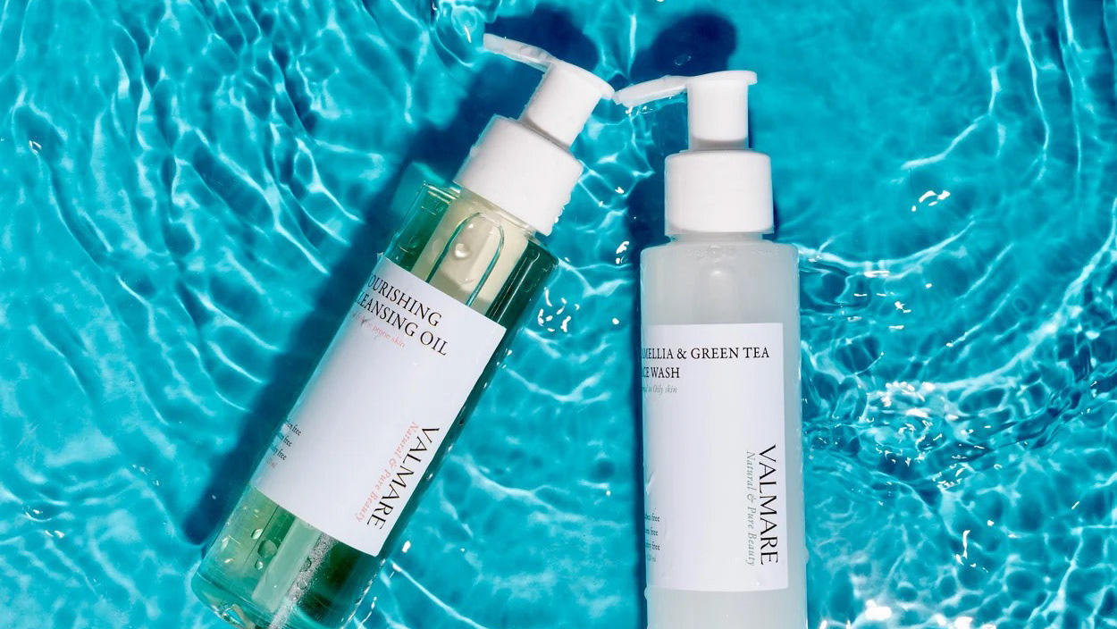
VALMARE BEAUTY - REBRANDING PACKAGING DESIGN
2023

TRAPPED-A MYSTERY/MOVIE BRANDING
2023
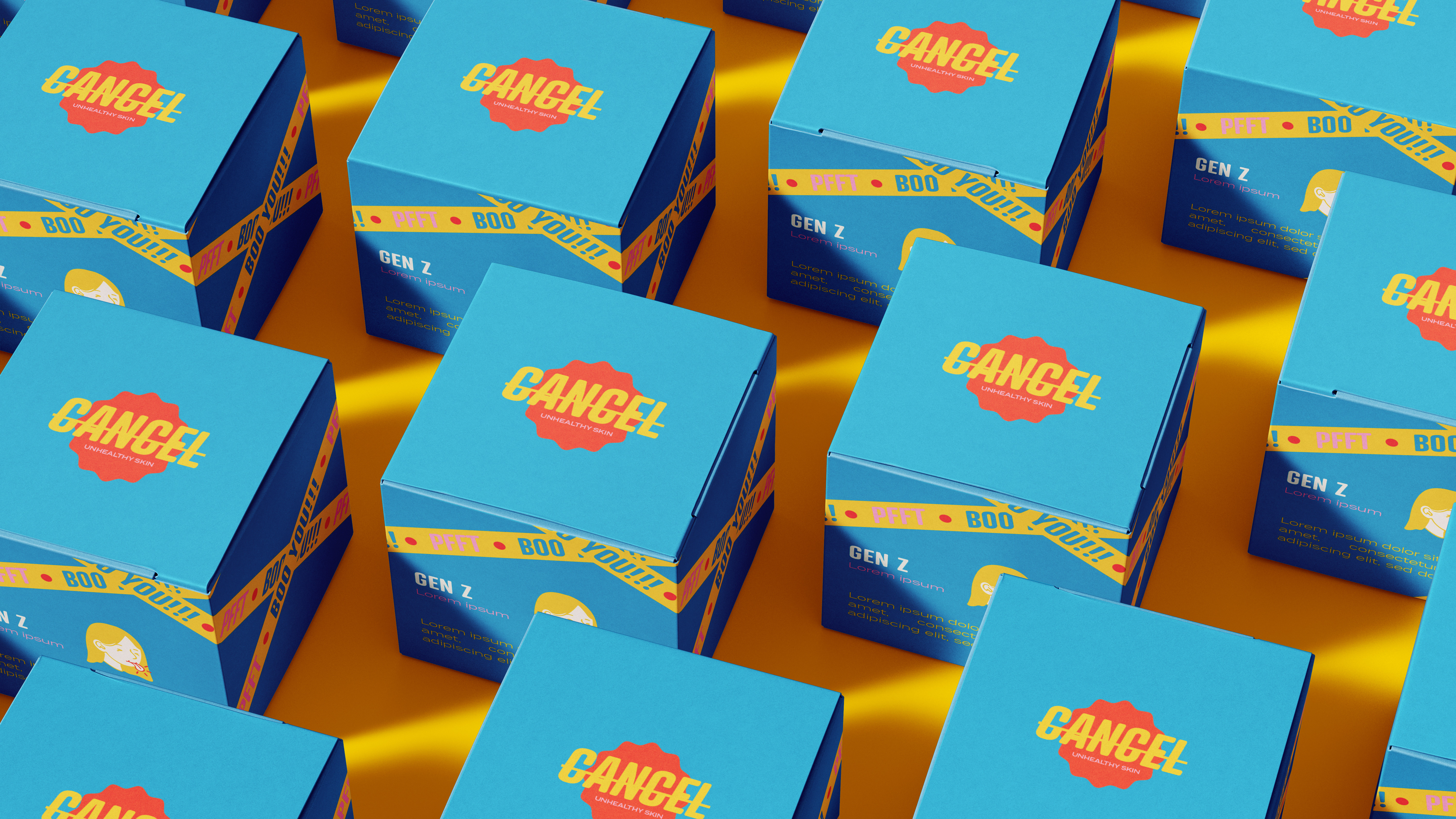
CANCEL/SKINCARE BRANDING & PACKAGING
2023
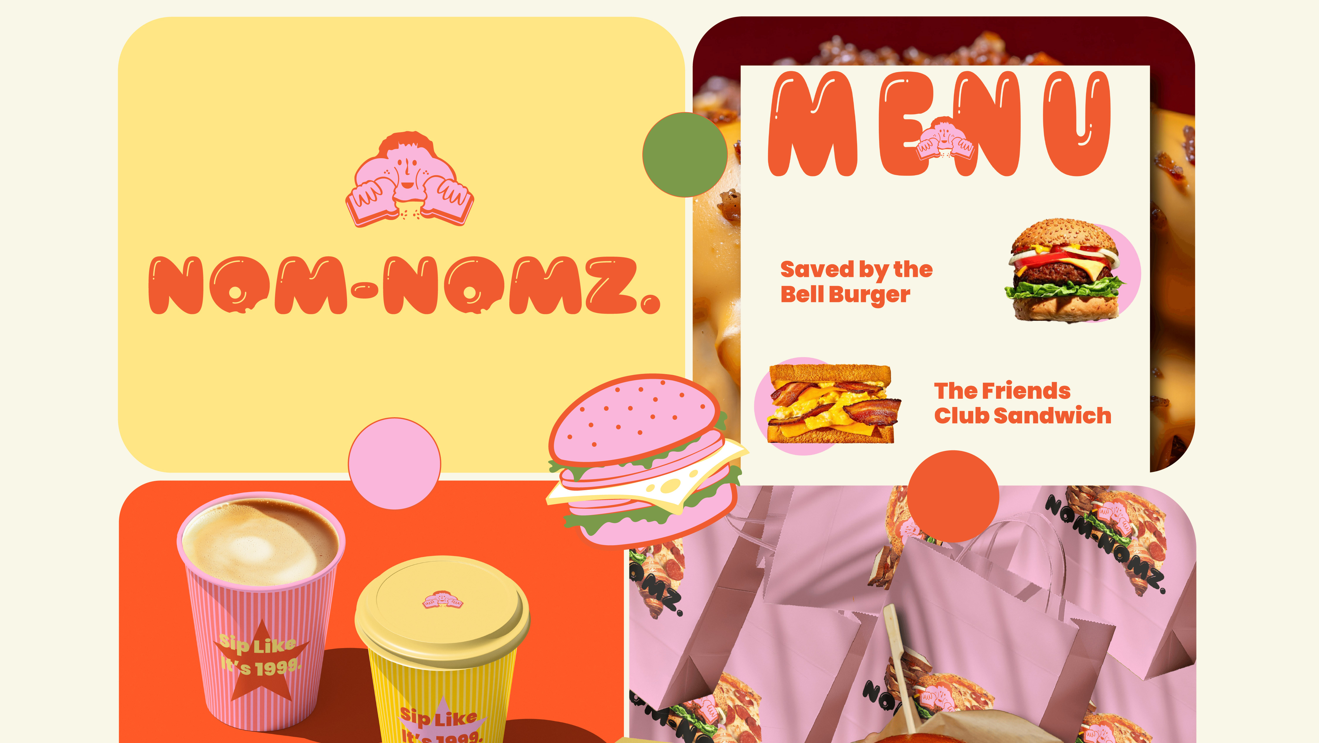
NOM-NOMZ- FOOD BRANDING AND PACKAGING DESIGN
2025
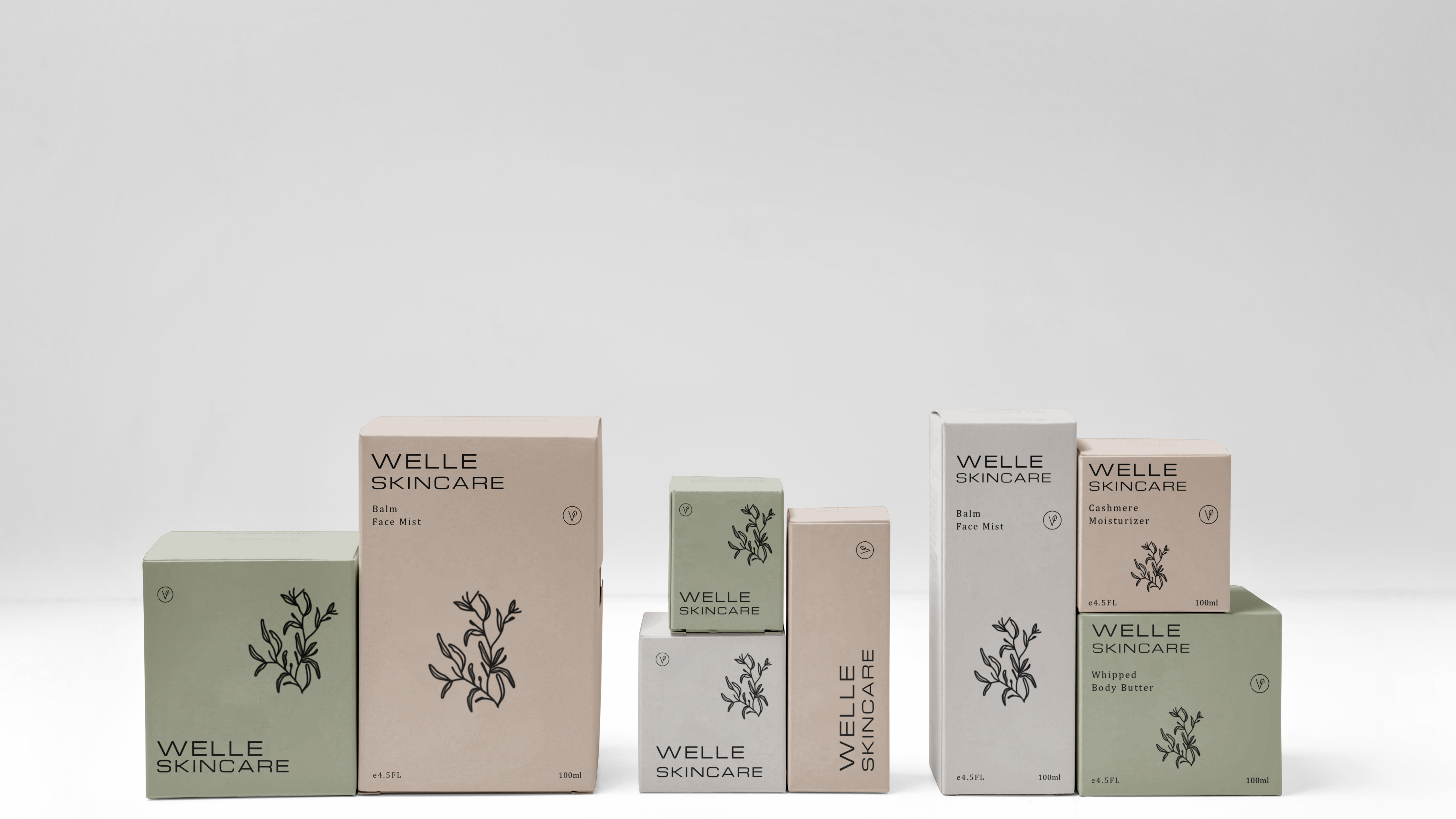
WELLE/ PRODUCT PACKAGING/ BRAND IDENTITY
2022
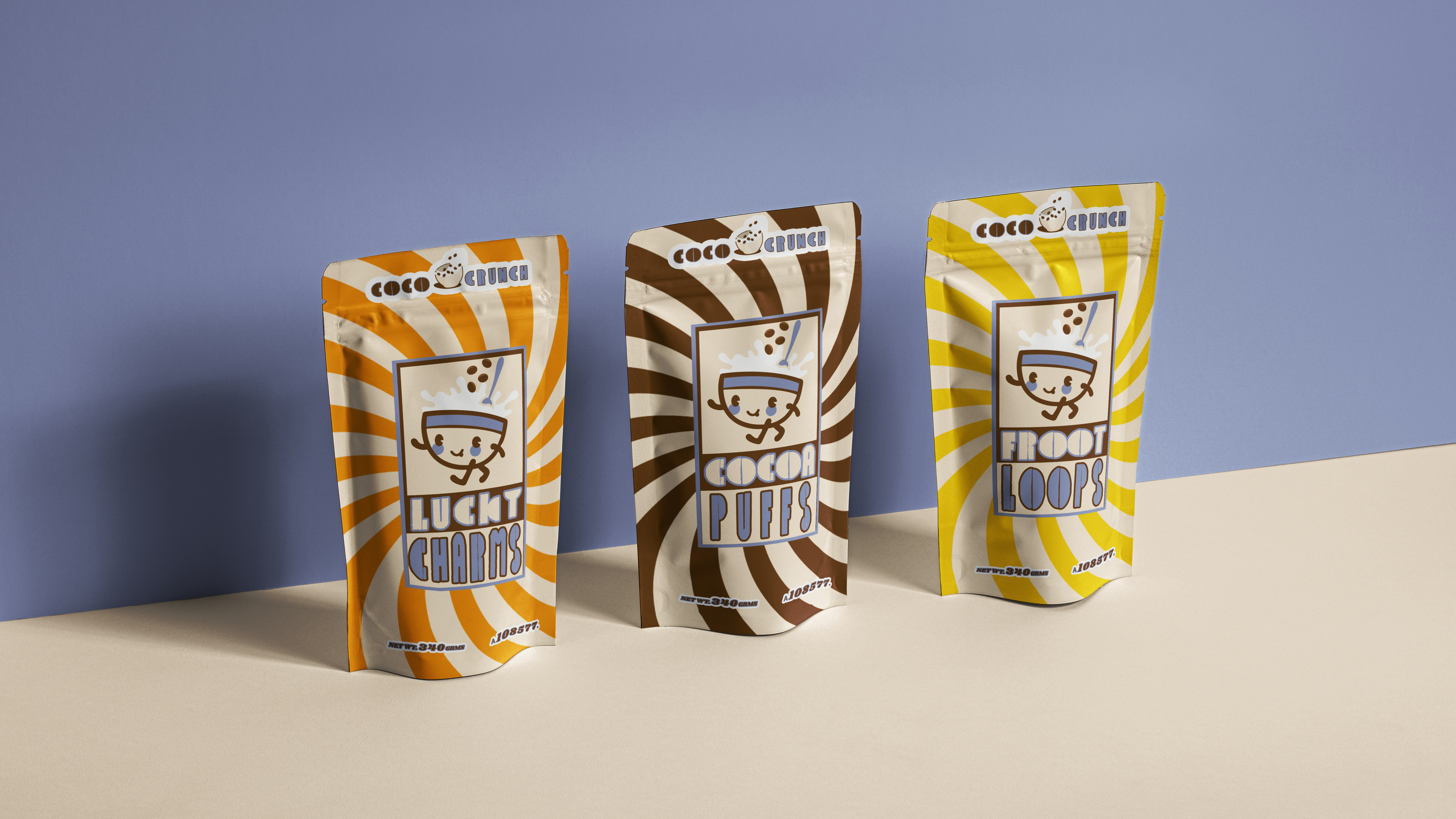
COCO CRUNCH/FOOD PACKAGING/ BRAND IDENTITY
2022
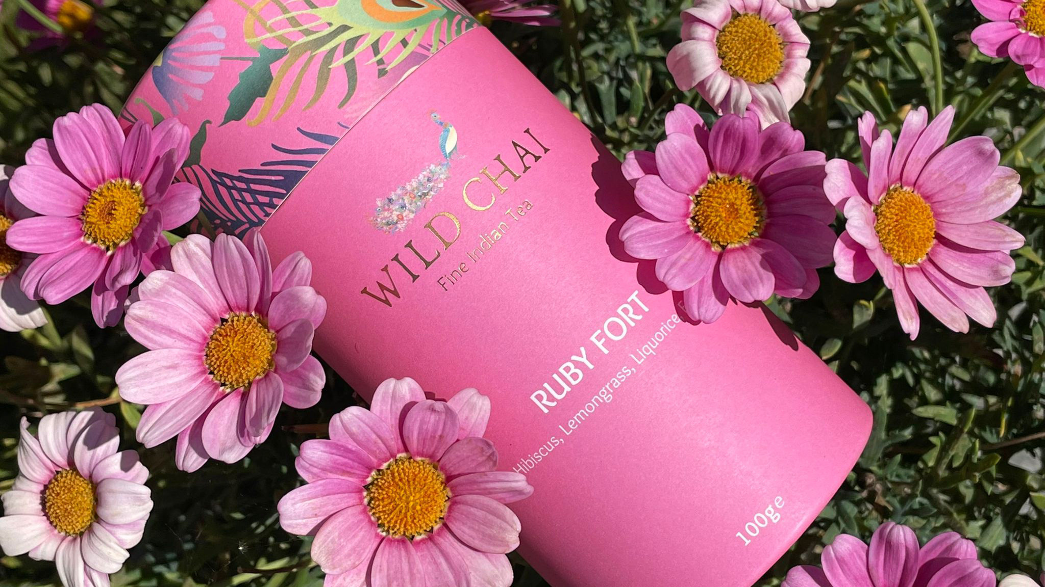
WILD CHAI - BRAND IDENTITY
2022

Kleo Skincare / Visual Identity
2021
